Back to the Lab

The apocalypse seems like fun!

Existential dread
2026 | Earth
Yay mass extinction
So exciting!
I’ve really enjoyed these last few weeks with Ireland’s third heatwave in less than a two months’ period. On the flip side, this summer is my first in which I’ve received a noticeable sunburn (on my forearm, mind you!).
 
Related to that, I’m impressed to summarise that we’re on track when it comes to actively destabilising the global climate, and thus hastening the ongoing mass extinction!
 
With mass death, widespread suffering and ecosystem collapses springing from nearly everything we’re doing these days, you might find yourself curious and keen on voyeuristically keeping track of all this destruction.

Don't worry, there's loads of tools to do that with:
Climate Centrals CSI map
Climate Control's CSI maps
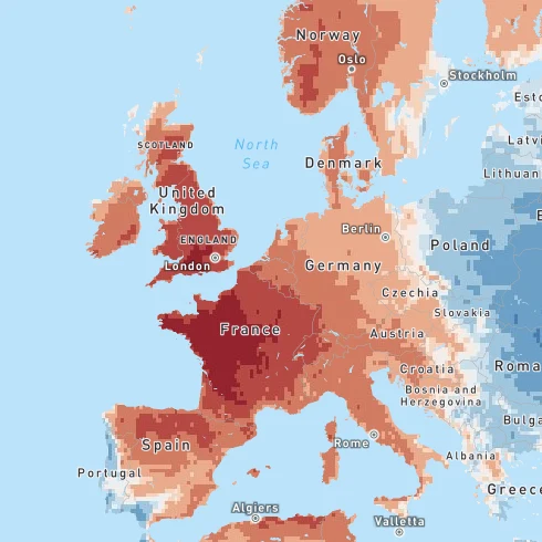
This interactive resource showing how current temperatures are deviating due to climate change is very pretty to look at. Scanning the Climate Shift Index-maps is particularly exciting. The whole website is visually appealing and convenient to use on both desktop and mobile. So funky to see temperatures in Morocco be abnormally cool, while western European has gotten so much warmer due to climate change.
Visit resource
European severe Weather Database
European Severe Weather Database
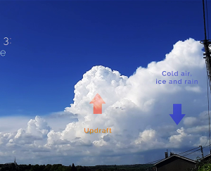
This web platform is visually a bit of a mess, but great fun to go through once you get the hang of it! Curious about this year’s tornado or other destructive weather events in Europe, and want images and articles showing these? Here’s the platform for you. The content is user-sourced, so if you yourself ever spot a tornado in real life you can add such event observations with evidence, links and what not.
Visit resource
IUCN Red List of Threatened Species
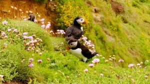
Too many animals, plants and ecosystems to count are not faring very well these days. Great environmental changes have taken place before in the history of Earth, but very, very, very rarely at the speed that we humans are changing conditions at. While this resource doesn’t throw pretty maps in your face, it is interesting to see how animals you might like or know are faring. I like puffins, but they’ve since 2012 been designated as vulnerable.
Visit resource
Burnt Areas in Europe
Current wildfire situation in Europe
There are a lot of wildfire risk map resources, but I find that much of the data is inconsistent across them. European Commission’s website isn’t the handiest visually, but it works and the maps are easy to read. There’s a crammed graph that shows how much progress we’re making with burnt areas in Europe along with some abstract numbers.
Visit resource
Windy com interface
Windy.com
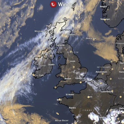
If there ever was a beast when it comes to an Earth Observatory-platform, then windy.com is that. Bringing images and simulation data from so many sources, it projects all of these as highly accessible visuals on a world map. The satellite imagery gives you an almost uninterrupted live view of the planet from above, and all the simulation data is live updated for accuracy. There are now fire risk maps, drought monitoring and weather warnings implemented. Exciting!
Visit resource
Will add as I find more favourites!